Example Showcase
Curo Calculator comes equipped with numerous examples designed to guide you through the usage of its extensive features. These examples help you master specific calculations quickly, bypassing the need for a steep learning curve.
With just 3 clicks or taps, you can execute calculations ranging from simple to complex, making it one of the easiest tools to use!
Important
The examples use nominal cash flow values based on the Euro, which may not scale well across different currencies due to varying exchange rates. While you can set your preferred currency in the Settings > Currencies tab, these settings only affect how data is displayed; they do not alter the underlying calculation values. Therefore, when using a different currency, you might need to manually adjust the example values to better fit your local context.
To access the examples:
Look for the third button from the left on your panel of quick action buttons, as shown in the image below.

Tap or click this button to open a pop-up panel with a scrollable list of examples.
Select the example you’re interested in by tapping or clicking on it. This action will automatically configure the Display Options and fill the input screen with the example data.
To execute the calculation, simply press the ‘Calculate’ button.
Additional and more in-depth information on each example is available via the menu on the left. These examples are designed to complement the calculation inputs by providing contextual insights into how the calculations work. They extensively use diagrams to visually explain financial cash flows, which is covered next.
Cash Flow Diagrams
A cash flow diagram is a visual tool that represents the timing and direction of financial transactions in a straightforward manner. The diagram below is taken from Example 1, typical of the diagrams accompanying other examples.
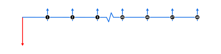
Understanding the Diagram:
Time Line: The diagram starts with a horizontal line representing the duration or contract term, which is typically divided into compounding periods.
Cash Flow Arrows:
- Upward Arrows signify cash inflows, such as money received by the lender, marked at the point on the timeline where the transaction happens.
- Downward Arrows indicate cash outflows, or money paid out by the lender.
Relating to the Calculator:
- The down arrow cash flows correlate with the data you input in the Advances section of the calculator input screen.
- Conversely, up arrow cash flows correspond to entries in the Payments section, and if applicable, the Charges section (see Settings > Charge Input).
Note, we use coloured arrows to quickly identify the known and unknown values:
- Red arrows are unknowns.
- Blue arrows are knowns; if all arrows are blue, the interest rate is the unknown to solve.
- There is one example with a green arrow, used to identify a non-financial charge cash flow.
Where there are a series of identical values, we’ve condensed the timeline rather than displaying them all. A concertina line will be displayed at the appropriate point, and we’ve numbered the payment cash flows before and after that point so you don’t lose track of the totals.
This visual representation helps in understanding how each transaction impacts the overall financial scenario over time, making complex calculations more intuitive.